Branding
ALPHA POST TENSTION PLC
Logo, system, and guidelines for an engineering client.
Alpha Post Tension PLC is a Grade One specialized post-tension company registered in Ethiopia, established by Ethiopian professionals with extensive technical knowledge and hands-on experience gained across the Middle East. The company delivers advanced post-tension engineering solutions for modern construction projects, combining international standards with local expertise. The objective of this project was to create a strong and professional brand presence that reflects the company’s technical excellence, reliability, and innovation in the construction industry. The visual identity and communication materials were designed to showcase Alpha Post Tension PLC as a trusted engineering partner capable of delivering high-performance structural solutions for complex construction developments. The branding approach focused on creating a clean, modern, and industrial visual language that communicates strength, precision, and professionalism while positioning the company competitively within the Ethiopian construction sector.
THE CHALLENGE
The main challenge was to create a visual identity that reflects the technical expertise and professionalism of Alpha Post Tension PLC while maintaining a clean and modern appearance. Since the construction and engineering industry is highly competitive, the brand needed a strong and recognizable identity that communicates strength, precision, and reliability. Another challenge was simplifying complex engineering concepts into a minimal and memorable logo system that could work effectively across different platforms, including company profiles, construction signage, social media, uniforms, and digital applications. The existing visual presentation also needed stronger consistency, improved typography, and a more premium industrial feel to position the company as a leading post-tension specialist in Ethiopia.

THE IDEA
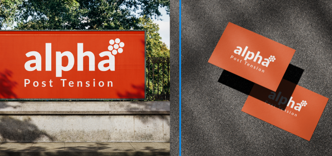
The creative direction focused on building a bold, modern, and professional identity that reflects the engineering precision and structural strength of Alpha Post Tension PLC. The branding was designed to communicate trust, innovation, and technical excellence while maintaining a clean and memorable visual system. A strong orange color palette was selected to represent energy, construction, visibility, and confidence, while the white typography creates a clean contrast that improves clarity and professionalism. The typography uses a modern sans-serif style to give the brand a contemporary and industrial appearance that feels stable, technical, and easy to recognize.
THE EXECUTION
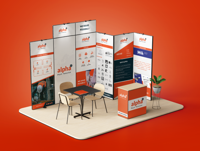
The layout approach was kept minimal and balanced, allowing the logo and typography to remain highly visible across both print and digital applications. Circular graphic elements were incorporated into the logo symbol to subtly represent tension cables, structural systems, and connectivity within modern engineering solutions. Overall, the branding style combines simplicity with strong industrial aesthetics to create a professional identity that positions Alpha Post Tension PLC as a reliable and forward-thinking construction engineering company.
THE IMPACT
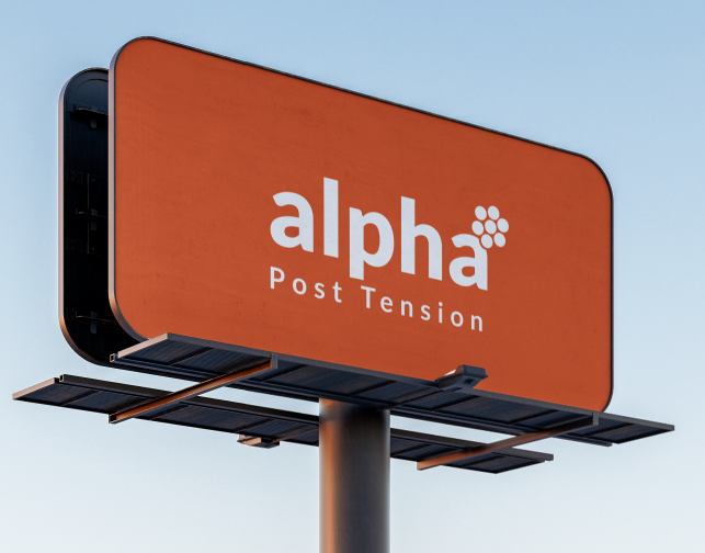
The final branding system helped establish a stronger and more professional identity for Alpha Post Tension PLC across both digital and print platforms. The new visual direction improved brand consistency and created a modern industrial appearance that better reflects the company’s technical expertise and engineering capabilities. The identity system was designed to increase brand recognition, strengthen client trust, and improve the company’s professional presentation within the competitive construction industry. Through the use of clean typography, bold color application, and structured layouts, the branding created a more confident and recognizable presence suitable for company profiles, construction materials, social media, and future marketing applications.